Case study
- Role
- Frontend Developer
- Organisation
- Vi8e Interactive Pte Ltd
Beauty & Spa Landing Page
A marketing landing page for a Singapore beauty and wellness clinic, built to convert: product highlights, a featured carousel, an Instagram feed, a mailing list and a consultation booking path. One page, one job.
01 / Overview
What I did.
I led the front end. The whole thing is HTML, CSS and JavaScript with jQuery, deliberately no framework, with mobile-first layout, a swiper carousel, smooth scroll navigation and a collapsible menu. The luxury feel comes from restraint in the palette, type and imagery rather than from effects.
02 / Architecture
Layers listed outermost first.
How it's put together.
Three flat layers with a hard line between them: markup that means something on its own, styling that adapts to the viewport, and behaviour layered on top of a page that already works without it.
Markup
Content that stands alone.
Semantic HTML in reading order, with the consultation call-to-action present in the document rather than injected by script. The page is complete before any JavaScript runs.
Styling
Mobile-first, widening up.
Hand-written CSS starting from the narrowest layout and adding at breakpoints. A restrained palette and generous type sizing do most of the work of looking premium.
Behaviour
Enhancement, not foundation.
jQuery and vanilla JavaScript for the carousel, smooth scrolling and the collapsible navigation. Each one enhances something that is already usable in its absence.
03 / Decisions
Each of these had a credible alternative. The trade-off is stated, not hidden.
Choices, and what they cost.
No framework at all
- Chose
- Plain HTML, CSS and JavaScript
- Instead of
- Vue or React
- A page builder or template theme
- Why
- This is one page whose only measure of success is how many mobile visitors book a consultation. A framework runtime is bytes and parse time spent before the first pixel, buying a component model that a single page never gets to amortise. Nothing here needed reactive state.
- Trade-off
- No component model, so repeated markup is genuinely repeated, so a change to a shared block is a change in several places. That is a real maintenance cost, and it would be the wrong trade the moment this became more than one page.
jQuery for the carousel rather than hand-rolled touch handling
- Chose
- An established slider plugin
- Instead of
- Writing touch, drag and momentum handling from scratch
- A CSS-only scroll-snap carousel
- Why
- Touch, drag, momentum and their differences between mobile browsers were the actual risk in this project: the part most likely to feel broken on somebody's phone and least likely to be caught in testing. That is exactly the work worth taking off the shelf.
- Trade-off
- A library dependency for a small amount of behaviour, and jQuery's own weight on a page whose entire argument is being light.
Mobile-first CSS, not desktop-down
- Chose
- Narrowest layout as the base, widening at breakpoints
- Instead of
- A desktop layout with overrides for small screens
- Why
- The traffic is mobile and the conversion is a thumb on a button. Starting narrow means the smallest screen gets the least CSS and no overrides to undo, and the layout is designed for the constrained case rather than squeezed into it afterwards.
- Trade-off
- The desktop layout has to be composed additively, which takes more thought when the design was handed over as a wide mockup.
Progressive enhancement over a script-dependent page
- Chose
- Content and the booking path working before JavaScript runs
- Instead of
- Rendering or revealing sections with JavaScript
- Why
- On a page whose only purpose is a conversion, a failed script must not mean a lost booking, and on mobile networks scripts do fail, arrive late, or get blocked. Keeping the content in the document means the worst case is a page that looks plainer, not one that is empty.
- Trade-off
- Some effects have to be given up, or built so their pre-JavaScript state is presentable, which constrains what the design can rely on.
04 / Stack
Grouped by the job they do rather than listed as a keyword run.
Technologies.
- Markup & styling
- Behaviour
- Approach
- Hosting
05 / Gallery
Select any image to view it full size.
How it looks.
Mobile
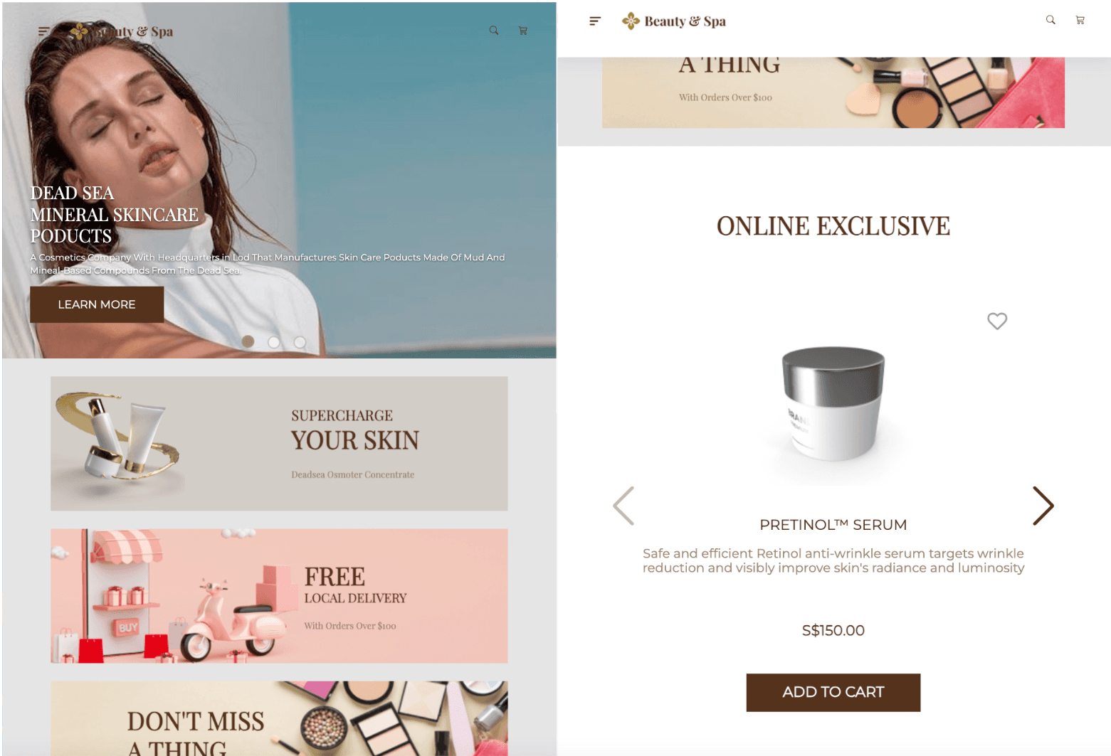
Hero. Web exclusive products. The carousel, the one piece of behaviour taken off the shelf. The consultation path, in the document rather than injected. Social proof. Mailing list.
Desktop
The same page, widened. Consultation on desktop.
06 / Outcome
Where it landed.
A fast, responsive landing page that gave the clinic a credible online presence and a clear booking path, well received for how it looked and how easily it read on a phone. The framework-free approach kept it quick on mobile networks, which was the entire point.